The study of colors’ effects on mood, emotions, and behavior is known as color psychology. Examining the effects of various colors on our emotions and thoughts is an intriguing field. Our evolutionary past, cultural upbringing, and individual experiences all play a significant role in how we see and respond to color.
Key Takeaways
- Color psychology explores the impact of different colors on human emotions and behavior.
- Warm colors like red, orange, and yellow can evoke feelings of energy, warmth, and excitement.
- Cool colors such as blue, green, and purple are often associated with calmness, relaxation, and tranquility.
- Neutral colors like white, black, and gray can create a sense of balance, simplicity, and sophistication.
- Cultural and personal experiences can influence individual associations with colors, making it important to consider diverse perspectives in color choices.
We can choose the colors we surround ourselves with in our homes, offices, and public areas by having a thorough understanding of the psychology of color. Colors have the power to arouse a vast array of feelings & associations, and they can significantly affect our happiness and general wellbeing. It has been demonstrated that certain hues cause particular psychological reactions; this information can be utilized to design spaces that encourage rest, productivity, or creativity. Through an awareness of color’s psychological effects, we can use color to improve our everyday environments and establish spaces that promote our mental & emotional health. Red, orange, and yellow are examples of warm colors that are frequently connected to vitality, warmth, and optimism.
Emotions like passion, happiness, and excitement can be evoked by these colors. Particularly red is a potent color for evoking a sense of urgency or excitement because it is known to arouse the senses and quicken the heart rate. While yellow is frequently connected to happiness and optimism, orange is frequently associated with zeal and inventiveness.
Warm colors are frequently used in interior design to create a homey and welcoming ambiance. They are frequently used in dining rooms and living rooms because they can create a more cozy and intimate atmosphere in these areas. Also useful for bringing life and vitality to a space, warm colors are often chosen for areas where people congregate & mingle. Warm colors are frequently used in branding and marketing to imply friendliness and warmth or to evoke a sense of urgency.
For instance, a lot of fast-food restaurants use the colors red and yellow in their branding to pique customers’ interest and generate excitement. Peace, tranquility, & relaxation are frequently linked to cool hues like blue, green, and purple. Feelings of stability, tranquility, and serenity can be evoked by these colors. The color blue is frequently thought to be relaxing and beneficial in lowering tension and anxiety levels.
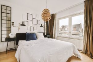
Its association with reliability and trustworthiness makes it a popular choice for corporate branding. A color that can inspire sentiments of harmony & balance, green is frequently connected to growth and the natural world. Purple can arouse feelings of mystery & sophistication and is frequently linked to luxury & creativity. Cool colors are frequently used in interior design to evoke a feeling of serenity and relaxation. They are frequently used in bathrooms and bedrooms because they can create the impression of more space and tranquility in these areas. Also useful for establishing harmony & balance in a space, cool colors are often chosen for areas where people want to de-stress.
Cool colors are frequently used in branding and marketing to imply professionalism & dependability. To imply stability & dependability, blue is a common color used by financial institutions in their logos. White, black, gray, and brown are examples of neutral colors that are frequently linked to elegance, timelessness, and simplicity. Emotions of serenity, harmony, and grace can be evoked by these hues.
Black is typically connected to strength and authority, while white is frequently associated with cleanliness & purity. Gray is frequently regarded as a neutral, adaptable hue that can inspire sentiments of harmony and impartiality. Brown is frequently thought of as being warm and earthy, and it can arouse sentiments of dependability and stability. Neutral hues are frequently used in interior design to convey a feeling of elegance & simplicity.
They are frequently utilized in minimalist or modern design styles because they can give the impression that a room is larger and more airy. Neutral colors are a popular choice for areas where people want to create a sense of calm and balance because they can also be used to create a sense of sophistication and timelessness in a space. Neutral hues are frequently used in branding and marketing to project dependability and professionalism. Neutral hues are frequently used by luxury brands in their branding to exude sophistication and elegance. In addition to universal associations, cultural experiences and individual experiences also have an impact on the psychological effects of color.
Based on their religious significance, historical significance, and customs, colors have different meanings for different cultures. For instance, white is frequently linked to marriage and purity in Western cultures, but it is also sometimes connected to grief in Eastern cultures. Similar to this, red is frequently connected to luck and prosperity in Chinese culture, but in other cultures, it might be connected to danger or passion. Our perception & response to color are also greatly influenced by our personal experiences.
For instance, a person who experienced a traumatic event involving the color red might associate that color negatively, whereas a person who grew up surrounded by green fields might associate the color green positively. When utilizing color to affect mood in various contexts, it’s critical to comprehend the cultural and individual associations associated with color. Given its ability to affect consumer perceptions and behavior, color is a critical component of branding and marketing. Marketers strategically employ color to elicit particular feelings or connections that are consistent with their messaging about their products or brand. Fast-food restaurants, for instance, frequently use the colors red & yellow to pique customers’ appetites and convey a sense of urgency, but luxury brands sometimes use muted hues like gold or black to suggest exclusivity and sophistication. Color can be utilized in branding to help a company stand out from the competition and become recognized.
For instance, using particular colors in packaging or logos can make it easier for customers to quickly recognize a brand. The ideals or character attributes of the brand can also be expressed through the color scheme. Green, for instance, can be used by brands that care about the environment to communicate naturalness or sustainability.
It’s crucial to take into account both personal preferences and the psychological effects of various colors when utilizing color to affect mood in your surroundings. The following are some pointers for successfully utilizing color:1. Take the space’s purpose into consideration: When you decorate or design a space, consider its purpose.
For instance, use cool colors like blue or green to create a soothing bedroom atmosphere. 2. Employ color accents: If you’re not sure whether to use strong colors on your walls or large furniture pieces, think about incorporating color accents into your décor with throw pillows, rugs, or artwork. Three. Be mindful of the lighting: Color appearance can be greatly influenced by the way light interacts with color.
Cool tones can be mellowed and warm colors brought out more vividly by natural light. 4. When selecting a color scheme for your environment, take into consideration your own personal associations with various colors. 5. Try out various combinations: Don’t be scared to try out various color combinations to see what suits your room the best. In summary, the psychology of color is a complicated but fascinating subject with broad ramifications for everyday life. Knowing the psychological effects of various colors allows us to strategically use color to affect mood in our surroundings, whether at work or at home.
Color design can have a significant impact on our emotional well-being, whether it’s for a restful bedroom retreat or an energetic workstation.
If you’re considering a home renovation project, you may want to check out this article on creative ways to finance your renovation. Understanding the psychology of color can also be helpful when choosing the color scheme for your newly renovated space, as different colors can influence mood and emotions. Whether you’re a first-time bathroom renovator or looking for financing options, it’s important to consider how the colors you choose will impact the overall atmosphere of the room.
FAQs
What is the psychology of color?
The psychology of color is the study of how different colors can affect human emotions, behaviors, and perceptions. It explores the impact of colors on mood, cognition, and physiological reactions.
How do colors influence mood?
Colors can influence mood through a combination of cultural associations, personal experiences, and biological reactions. For example, warm colors like red and yellow are often associated with energy and excitement, while cool colors like blue and green are linked to calmness and relaxation.
What are some common associations with specific colors?
– Red: Often associated with passion, energy, and excitement, but can also evoke feelings of anger or danger.
– Blue: Linked to calmness, trust, and stability, but can also be perceived as cold or distant.
– Yellow: Often associated with happiness, optimism, and warmth, but can also be overwhelming in large amounts.
– Green: Linked to nature, growth, and harmony, and can have a calming and balancing effect.
– Purple: Often associated with luxury, creativity, and spirituality, but can also be seen as artificial or mysterious.
Are color associations universal or culturally specific?
While some color associations may have universal elements, many are culturally specific. For example, in Western cultures, white is often associated with purity and weddings, while in some Eastern cultures, it is linked to mourning and funerals.
How can businesses use the psychology of color to their advantage?
Businesses can use the psychology of color to influence consumer perceptions and behaviors. For example, fast-food chains often use red and yellow to stimulate appetite and create a sense of urgency, while luxury brands may use black and gold to convey sophistication and exclusivity.